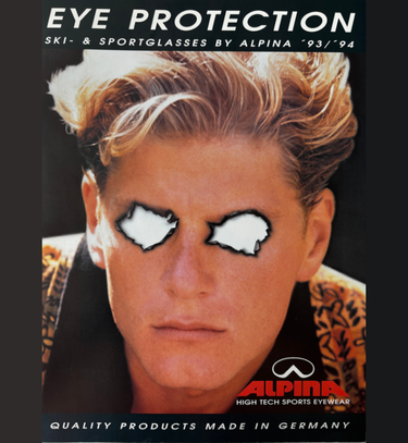
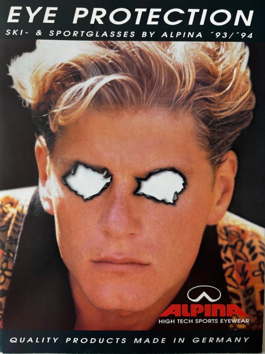
As early as the beginning of the 1980s, ALPINA understood how to set accents in brand communication through bold and innovative design. With extraordinary cover designs and unconventional catalogues, the company not only presented products but also created trends that reached far beyond the world of sport. This approach shaped the company’s visual identity in a lasting way and generated attention within the industry – as seen in the ALPINA cover from the 1993/94 winter season. Reduced and direct, it dispenses with familiar winter sports imagery such as snow, speed or Alpine panoramas and instead relies on an abstract visual language.
At the centre is the portrait of a young man – photographed head-on, calm, expressionless. No ski goggles, no helmet, no typical sportswear. Instead, a patterned top somewhere between streetwear and everyday 90s fashion. But the decisive element lies elsewhere: the eye area has been removed. The gaze remains hidden, and the person becomes intangible.
It is precisely this void that gives the motif its tension. It creates distance and leaves space for interpretation. The claim “EYE PROTECTION” almost seems like a contradiction: the eyes are missing – and it is this absence that brings the topic of protection to the forefront. Without protection, eyes become vulnerable, perhaps even “taken away”.
The glasses – the actual subject of the advertisement – are also missing. And this is exactly what shifts the focus away from the product itself and towards something more fundamental: perception, identity, invisibility.
Today, the motif can be read not only as an advertising image but also as a commentary on the visual language of its era. It breaks expectations, deliberately avoids explanations – and shows how powerful design can be when it remains open.
A piece of analogue design history that continues to resonate today. ALPINA exists to protect people so they can truly live in the moment – freely, confidently and connected. When you feel safe, you move differently: more boldly, more creatively, more present. This is how ALPINA inspires. made to protect – made to inspire.
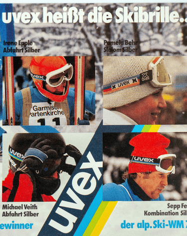
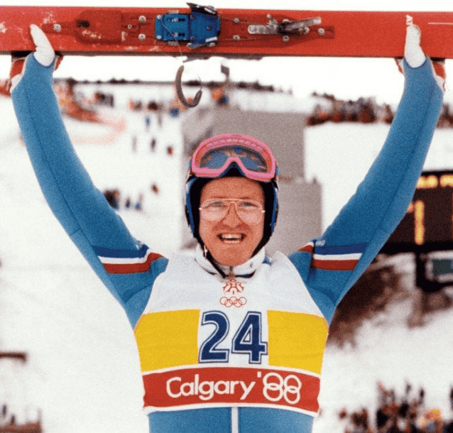
Some additional cover examples from that time: